Category share pies on the dashboard
xpenser added pie indicators to dashboard category rows so users can scan each category share of income or expense totals.
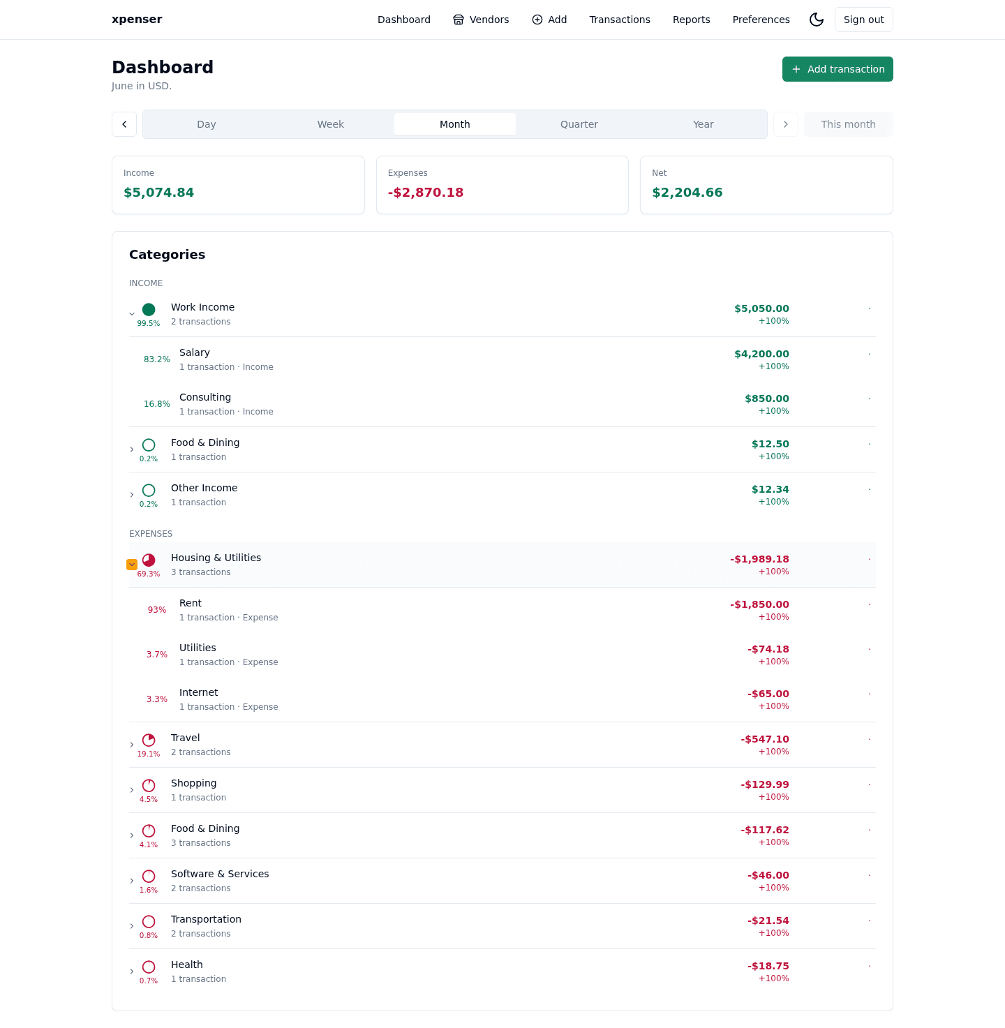
Category rows now show proportional share indicators next to the amounts they summarize.
This release came from PR #13 and is now part of the xpenser release archive. It gives people evaluating an open-source expense tracker a clearer view of how the product has improved over time.
What changed
- Added a leading pie indicator to each dashboard category row.
- Computed each category share from income and expense totals.
- Colored indicators by category type and showed formatted percentages.
Why it matters
Percentages help users understand whether a category is a small detail or a major part of their spending pattern.
Where it fits
This makes the dashboard more useful for quick expense analysis without opening a deeper report.
For a broader product overview, start with the xpenser home page. Developers can also explore the personal finance API and MCP tools, while self-hosters can review the self-hosted personal finance tracker page.